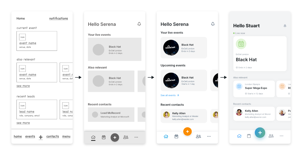
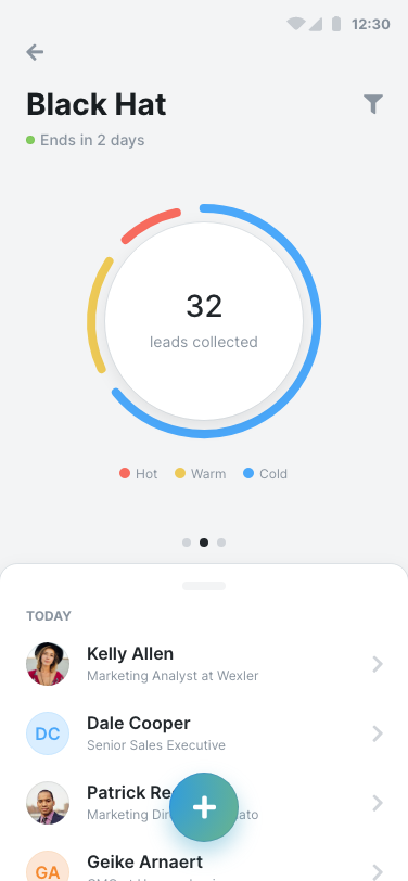
Home screen
The home screen was redesigned to allow for quick lead captures outside the context of an event and to bring forward relevant and contextual information.
Tap the screenshot to see how it compares to the previous version of the app.
In Q1 2021, roughly six months after having started to work on our new web platform, we turned our attention to the mobile app. This time we’re not starting a new codebase, but building on top of the existing one.
We had two major goals with this project:
As usual, we started out by laying down very rough (and I mean rough) screens with all the interactions needed to map the underlying structure and then creating wireframe prototypes that we could put in front of people and start gathering feedback.
After having gathered tonnes of feedback, we finally started working on refining the visuals and the interactions.
Here are some of the highlights:
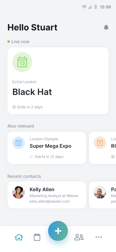
New
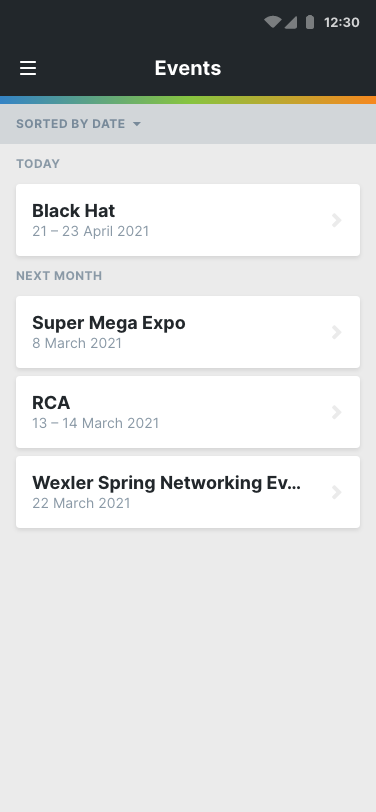
Old
The home screen was redesigned to allow for quick lead captures outside the context of an event and to bring forward relevant and contextual information.
Tap the screenshot to see how it compares to the previous version of the app.
New
Old
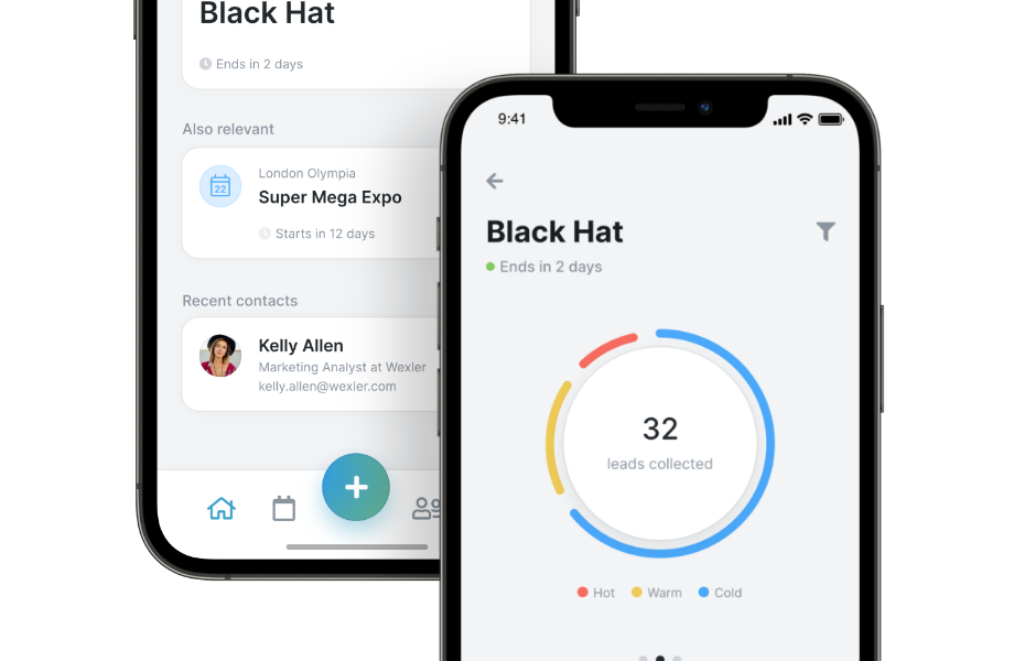
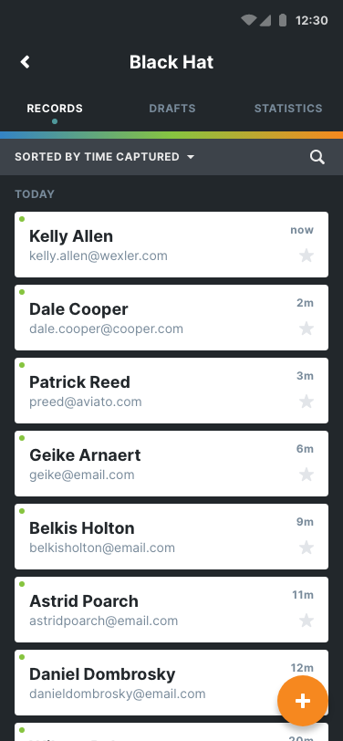
We packed the event view with more information, but in a way that isn't too overwhelming for our users.
Tap the screenshot to see how it compares to the previous version of the app.
New
Old
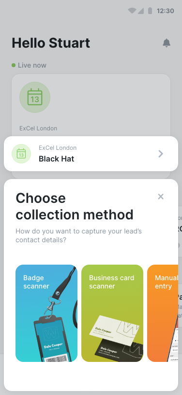
The collection method selection was completely redesigned to separate it from the collection form and make for an easier experience.
Tap the screenshot to see how it compares to the previous version of the app.
New
Old
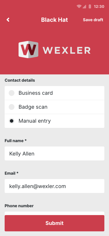
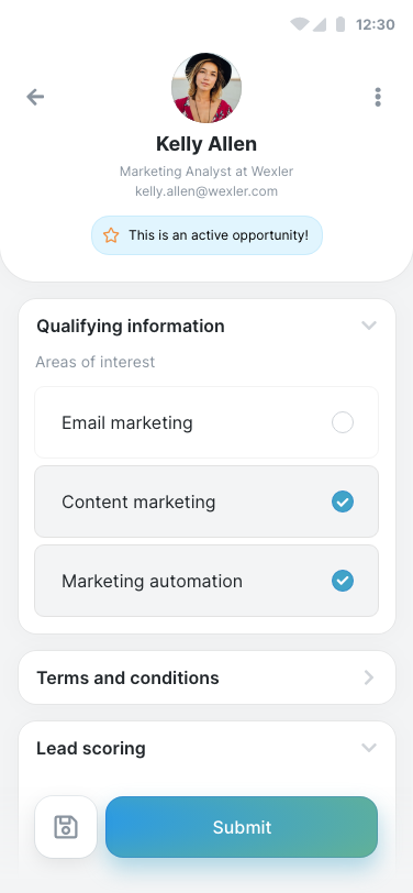
The form was updated to highlight lead information and separated into different, logical sections to simplify the capture process.
Tap the screenshot to see how it compares to the previous version of the app.
This project is actively being worked on and will be released later in the year.